Redesign of Learner Resources Page
My Role: Ideation, wire-framing, user testing, prototyping, visual/brand design, interaction design
Introduction
Decoded is an NYC based tech education company that delivers facilitation sessions to companies in order to get them up to speed on technical concepts such as big data, AI, blockchain, and increase their digital literacy.
Task
Following a facilitation session, many users are looking for a way to stay engaged with the material. Decoded facilitators are able to offer their current resources page, but it is limited in what it offers and does not facilitate long-term engagement from the users following a session.
As a UX Design intern, I was tasked with conducting a review and redesign of the resources page with the goal of improving the end-to-end learner experience and deliver a more positive off-boarding experience via the resources page.
Methods
I approached this redesign by conducting a discovery phase in which I spoke to members of both the company’s US and UK teams to gain insight into their perspectives on the current state of the resources page.
I then used the results of this discovery phase along with my own evaluation of the resources page to identify critical pain points that became actionable design objectives.

With these objectives in mind, I used a combination of Sketch and Adobe XD to design a high-fidelity digital prototype that addressed the above pain points in the following ways :
Information was organized into the company’s 4 Mindsets : Data, Hacker, Innovator, Developer


Incorporated a greater emphasis on visual design, as well as copy

Give users the ability to personalize their experience via the ability to log in to their own account and then save/favorite content to a “My Resources” page

Using this first prototype, I then recruited 5 users from the office for an informal click-through usability testing session, with a think-aloud component to the test. They were given 4 very basic tasks, and then presented with a set of debrief questions after the test.
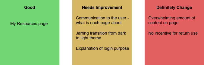
Following the user testing, I categorized the findings into positive feedback, mixed feedback, and negative feedback.
I then worked to iterate upon this feedback.
Key Learnings
The main goal of this redesign was to provide an experience through the resources page that motivated users to return to the page and continue using it, thereby maintaining the company-client relationship for longer. However, upon conducting the user research, it became clear that the initial design did not achieve this.
Having to in some ways, return to square one after testing was a major obstacle and challenge that I faced during this project. However, it was also an incredibly valuable learning experience.
I definitely learned the importance not only of a user testing phase, but also of asking the correct questions and choosing the appropriate method of user testing. If I had solely relied on a think-aloud protocol, I would not have been able to ask the pointed questions I wanted, and conversely had I only relied on a set of predetermined interview questions, I might have missed key information that the users had to share.
This project was also crucial to my understanding of brand identity and visual design as a part of a holistic user experience.
Ultimately, this was a formative experience in my growth as a designer, as I worked under the pressure of deadlines to deliver a solution that did not operate in a vacuum or as a standalone product, but rather needed to fit seamlessly into the end-to-end user experience.
The Outcome
The final outcome addressed the functional issues brought up in the user testing sessions, while stripping back the visual design to fall in line with the brand identity that is consistent with the existing Decoded suite of products, so as to be more familiar and usable to the company’s global user base.

I targeted the key issues highlighted in the user testing in the following ways:
Overwhelming content on Pages:
Glossary section changed to interactive flashcard UI
Session Links section made to be collapsible
Scrolling through media made to be horizontal (similar to Netflix)
“Stay in the Know” blog changed to it’s own page, rather than having a “Stay in the Know” for every mindset

Flashcard layout
Horizontal Scrolling
Communication to the user
Each page and the login page has a small introduction paragraph

Introduction paragraph for each mindset page

Introduction to the user login
Lack of incentive to return
Resources/practice opportunities marked with “New!”
Feature for users to mark practice sources as complete.

Resources marked as “New” to incentivize users to come back
While not a finished product, this solution presents the most actionable and promising step forward to improving the end-to-end learner experience, by maintaining and prolonging a learner’s engagement with the material, while also strengthening their relationship with the Decoded brand.
View a full run-through of the final design here.